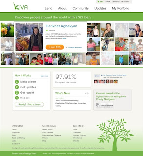
Last week we previewed a few of the ways we are turning your feedback into changes on our site and today we are happy to announce: the new Kiva.org is live!
The redesign is the result of thousands of hours of consultation with lenders, meetings with designers, drafts with employees, and feedback from the Kiva community. There is one team in particular that we owe special thanks to. Hot Studio, a San Francisco based design firm, has been the driving force behind the creation and implementation of our new look. Without the incredible talent and determination of Hot Studio, our redesign would have not been possible. Thank you to the Hot Studio team for the hard work and long hours you have committed to Kiva and our community!
We hope you will take a few minutes to see what we have improved, but we want you to know that the functionality of the site has not changed. The look and feel may seem different, but your options to lend, learn and share have remained the same!
The first thing you’ll notice when you arrive at kiva.org is that the homepage looks radically different. Gone are the numerous sections, constantly fighting for your attention. In their place, you see a clean, streamlined matrix of featured loans, along with simple options for learning more or finding a borrower.
When you arrive at the lend page, you'll notice that the content is not all that different than what you’re used to. Sure, the colors have changed, the feel is warmer and cleaner, but by and large, searching for a loan works much as it has before.
Once you click into a loan, you’ll notice that the loan profile page has been simplified as well. While nothing has been lost from the current profile page, we have moved around a few things, and cleaned up sections that were becoming unwieldy. You may notice that the "loan type" has been moved to the top of the page. Also, like the lend tab, the new profile page serves the same purpose as it did before.
Kiva has been at the forefront of a microfinance revolution that has altered the way that the world thinks about charity, development, and combating poverty. Thanks to your feedback, we’re hopeful that this new and improved design will make for an even more enjoyable lending experience.
Have questions or comments about our new look? We want to know.
PREVIOUS ARTICLE
Empowering women through microfinance in Ghana →NEXT ARTICLE
The Ripple Effect of Helping Women →


