Tens of thousands of people visit Kiva every day looking to support a borrower. Unfortunately, a significant number leave the website without making a loan because they feel overwhelmed when having to choose who to support. Today, I’m excited to share a redesign we've seen help new visitors choose a loan, while also delivering new features to those of you who’ve been lending for years.
So what can you expect from this new loan finding experience?
Loans are grouped into categories: In the new design we now prominently feature categories such as Expiring Soon and Agriculture loans. The categories are a mix of lender favorites and some curated by Kiva staff. When you click through you’ll be able to view more loans, read about the category and narrow your search by related keywords and filters.
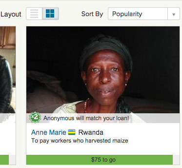
 Grid and list layouts: If you love looking at borrower photos, you’ll want to stay with the default grid view, where borrower photos take center stage. On the other hand, if you want to quickly browse by loan details you can toggle to list view.
Hint: In grid view, sorting by criteria such as loan length, loan amount or most recent will reveal related details in the upper right corner of each loan card.
You can change the way loans are sorted and toggle between grid and list view using the controls directly above the borrower photos (pictured at right above Anne Marie's loan).
My Lists: When you’re looking for loans, you can save favorite loans and searches, and access them easily from the My Lists menu at the top of the page (marked with a star). It's also easy to add a loan to your list of favorites by just clicking the star.

You can access Advanced Filters, My Lists (which contains favorites and saved searches) and settings from the secondary menu at the top of the page (pictured above).
 Advanced Filters: If you want the full power of every Kiva filter, we’ve retained a familiar layout while adding new filters such as loan length and tags. If you prefer this advanced filters layout over the category-focused page, you can make it your default view in your settings (marked with a gear symbol at the top of the page).
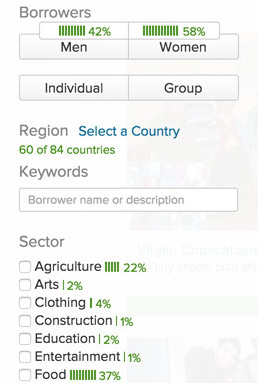
We’ve also added a powerful new way to view your past lending activity while searching for your next loan. Lenders have told us they wanted to be able to easily understand their portfolio distribution when choosing their next loan – now you’ll be able to see the percentage of loans you’ve made across gender, sector and country. Give it a try using the “%” button at the top of the sidebar, the percentages will appear alongside the advanced filters, as pictured at right.
Now that we’ve gone over a few of our new features, let’s back up a bit and share how we got here. In 2014 we dedicated a considerable amount of time to understanding how and why people make loans on Kiva to ensure the new design works well for all lenders, whether you’re making a first loan or you’ve been lending since day one and have supported thousands of loans.
Using a variety of methods including interviews, user testing and surveys, we solicited feedback from across the spectrum to help us identify a few common problems people had. Over and over we heard that lenders felt:
- Overwhelmed by the number of choices
- Confused by the existing filter and search tools
- Disappointed if they were unable to find loans that met their criteria (so much so that they left the site entirely)
The great news is we’ve already seen a reduction (or elimination) in most of the problems listed above. For example when we watch lenders use the new category-based finding experience we no longer hear comments of being overwhelmed by the number of borrowers. We’ve also seen a meaningful improvement in the conversion rate (the percentage of visitors who complete the loan process), which translates to millions of additional dollars for borrowers every year and fewer loan expirations.
We hope you'll be as excited about this new design as we are, and we'd love to hear your feedback. If you don’t see the new design give it a try here (you can always switch back). Do these changes make it easier for you to find borrowers you want to support? Are there features you’d like to see in the future or did you find a bug? Email us at blog@kiva.org.
PREVIOUS ARTICLE
Toya’s Dream: To overcome tragedy with beauty →NEXT ARTICLE
One Tanzanian's Trash is Another Tanzanian's Treasure →


