Over the years, we’ve collected an enormous amount of feedback from our users, partners, and friends about how we can make Kiva’s website a better place to engage with our lenders. Today we’re pleased to give you a preview into how we’re translating that feedback into action.
Next week, we’ll be rolling out a new and improved kiva.org. This redesign is the result of thousands of hours of consultation with lenders, meetings with designers, drafts with employees, and feedback from the Kiva community. The result is a site that we hope will help set Kiva up to tackle the challenges of pursuing the ambitious goals that our community has come to expect from us.
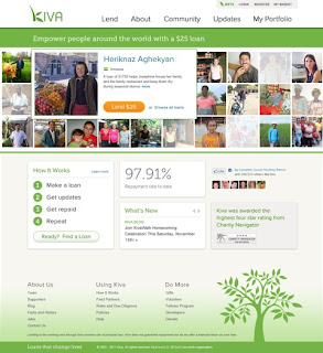
The first thing you’ll notice when you arrive at kiva.org is that the homepage looks radically different. Gone are the numerous sections, constantly fighting for your attention. In their place, you see a clean, streamlined matrix of featured loans, along with simple options for learning more or finding a borrower.
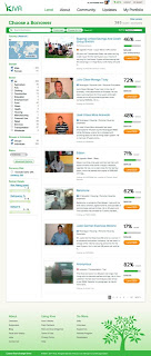
When you arrive at the lend page, you'll notice that the content is not all that different than what you’re used to. Sure, the colors have changed, the feel is warmer and cleaner, but by and large, searching for a loan works much as it has before.
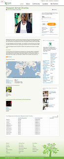
Once you click into a loan, you’ll notice that the loan profile page has been simplified as well. While nothing has been lost from the current profile page, we have moved around a few things, and cleaned up sections that were becoming unwieldy. Also, like the lend tab, the new profile page serves the same purpose as it did before. 
That's an important point: next week, Kiva will function much the same as it has before—no capabilities that you have today will cease to exist, and no dramatic changes to how you search for and fund loans will surprise you.
Kiva has been at the forefront of a microfinance revolution that has altered the way that the world thinks about charity, development, and combating poverty. Thanks to your feedback, we’re hopeful that this new and improved design will make for an even more enjoyable lending experience.
We can’t wait for you to see the whole enchilada next week!
PREVIOUS ARTICLE
Five things you may not know about Rwanda →NEXT ARTICLE
Update from the Field: Man’s Day, Singing Fellows + Learning How to Count →


